You spent $8,000 on a new website. It looks sharp. The photos are professional, the practice area pages are thorough, and your bio lists every accolade you’ve earned. And yet — the phone isn’t ringing.
This is one of the most common — and expensive — problems in legal marketing. Law firm websites that look credible but fail to convert visitors into leads. The design agency got paid. The hosting bill goes out every month. But the site sits there like a digital brochure, generating almost nothing in return.
The reasons are predictable — and fixable. Here are the five most common conversion killers on law firm websites, and what top-performing firms do differently.
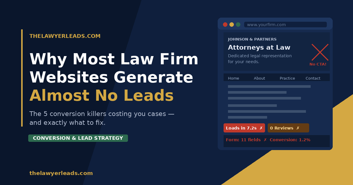
1. Your CTAs Are Invisible (or Nonexistent)
Walk around your website right now and ask: What do I actually want a visitor to do? Most law firm sites answer that question with a timid “Contact Us” link buried in the navigation.
That’s not a call to action. That’s a door with no sign on it.
People visiting a law firm’s website are often anxious, confused, and in a hurry. They’re not going to hunt for a way to reach you. You have to make the next step impossible to miss.
What high-converting firms do instead:
- Place a bold, high-contrast CTA button above the fold on every page — visible without scrolling
- Use action-oriented language: “Get a Free Case Review” dramatically outperforms “Contact Us”
- Repeat the CTA at the bottom of every practice area page
- Add a sticky header or floating button so the CTA is always visible while scrolling
▶ Quick Win
Open your homepage right now. If a visitor can’t see a clear call-to-action button without scrolling, you’re losing leads every single day. Adding one above the fold is the single highest-ROI change most law firm sites can make — and it takes an afternoon to implement.
2. The Site Loads Too Slowly on Mobile
More than 60% of legal searches now happen on a smartphone. Someone just rear-ended at a stoplight or watching a loved one get handcuffed isn’t going back to their desk to find a lawyer. They’re searching on their phone, right then.
If your site takes more than 3 seconds to load on mobile, most of them are gone. Google’s own data shows that 53% of mobile users abandon a page that takes longer than 3 seconds to load. You’re not just losing leads — you’re losing your ad spend along with them.
The culprits are usually the same: bloated image files, too many plugins, cheap hosting, and no caching layer. These aren’t difficult to fix, but most attorneys never check because the site “looks fine” on their office desktop.
How to diagnose it:
- Run your site through Google PageSpeed Insights (free at pagespeed.web.dev). Look at the Mobile score specifically.
- Anything below 70 is hurting you. Below 50 is a serious problem.
- Share the report with your web developer and ask about image compression, lazy loading, and server response time.
3. No Trust Signals Above the Fold
A person searching for a personal injury attorney after a car crash isn’t just looking for a lawyer — they’re looking for a lawyer they can trust. Trust is the conversion variable most law firm websites completely ignore.
Look at your homepage. What does a first-time visitor see in the first 5 seconds? If the answer is a stock photo of a gavel, a tagline about “fighting for your rights,” and a navigation menu — you’ve given them nothing to trust.
Trust signals that actually convert:
- Real Google review count and star rating (not just “5 stars” written in text)
- Specific case results — “Settled: $1.2M | Truck accident” — numbers outperform vague claims every time
- Bar association memberships and recognitions with logos
- A real photo of the attorney — not stock imagery
- A direct phone number that’s clickable on mobile
4. The Contact Form Has Too Many Fields
Every field you add to a contact form is a reason for someone to abandon it. Law firm forms that ask for name, phone, email, case type, date of incident, description, preferred contact time, and how you heard about us are leaving significant leads on the table.
Think about who your visitor is: someone in emotional distress, probably on their phone, who has already hesitated before clicking “Contact.” Every extra field is another opportunity for them to think “maybe I’ll call someone else.”
Form length vs. conversion rate:
| Form Fields | Avg. Conversion Rate | Notes |
|---|---|---|
| 3 fields or fewer | ~11–15% | Name, phone, brief message |
| 4–5 fields | ~7–10% | Acceptable for qualifying leads |
| 6–8 fields | ~3–5% | Significant drop-off begins |
| 9+ fields | Under 2% | Most visitors will abandon |
The recommendation: start with 3 fields — name, phone number, and a brief description of their situation. You can qualify leads by phone. That’s what the consultation is for.
5. The Website Is Written for Other Lawyers, Not for Clients
This is the subtlest — and most common — conversion killer of all. Most law firm websites are written in a tone calibrated to impress other attorneys. They’re dense with legal terminology, passive-voice sentences, and institutional language that signals authority to a peer audience.
But your website visitors aren’t other lawyers. They’re ordinary people who are scared, confused, and just want to know: Can you help me? Do you understand my situation? Can I trust you?
The rewrite test:
Pick any paragraph from your homepage and ask: could a stressed-out 38-year-old who just totaled their car understand this in 10 seconds? If not, simplify it.
- Replace “we zealously advocate for your legal rights” with “we fight to get you the money you deserve”
- Replace passive voice (“cases are handled”) with active, human language (“I personally handle every case”)
- Lead with the client’s problem, not your credentials: “Injured in a car accident? Here’s what to do next.”
The 5 Conversion Killers — Quick Reference
- Invisible or weak CTAs — Add a bold, specific CTA above the fold on every page
- Slow mobile load time — Run PageSpeed Insights and fix anything scoring below 70
- No trust signals — Add reviews, case results, and real photos above the fold
- Too many form fields — Cut to 3 fields; qualify by phone during the consultation
- Written for lawyers, not clients — Rewrite for a stressed, non-expert visitor on a mobile phone
The Bottom Line
A well-designed website and a high-converting website are not the same thing. Most law firms have the former. Very few have the latter.
The good news: each of the five problems above can be diagnosed and fixed without rebuilding your entire site. Start with the CTA on your homepage, run a mobile speed test, and do a quick read-through asking whether a scared first-time visitor would trust what they see.
If you’d rather skip the audit and get leads flowing right now — that’s exactly what we’re here for.
Get a Free Website Conversion Audit
We’ll review your law firm’s site and identify the top 3 changes that would generate more leads immediately. No obligation, no sales pitch.